

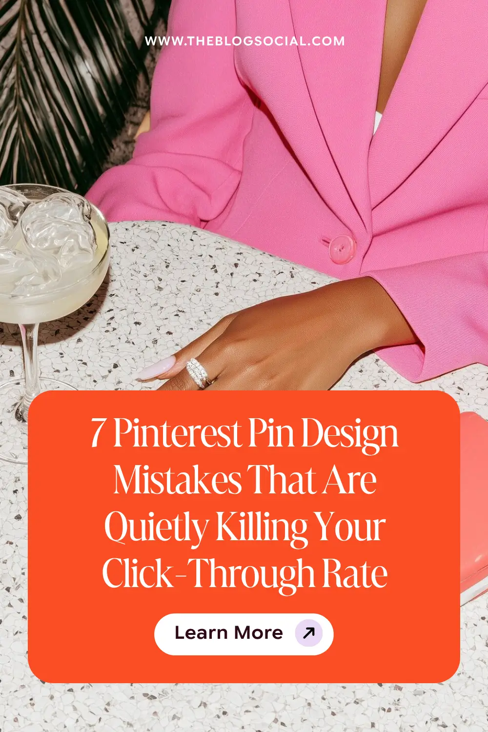
Your pins look beautiful, and still get no clicks. The problem is almost never the design itself; it’s the strategy behind the design. This post breaks down the 7 most common Pinterest pin design mistakes bloggers make, why each one quietly tanks your click-through rate, and the exact fixes to apply before you pin again.
When Your Pins Look Good, and the Clicks Still Don’t Come
You spent an hour in Canva. You found the perfect background, matched your brand colours, and wrote a headline you were actually proud of. You scheduled it. You waited.
Four hundred impressions. Six saves. Two clicks.
So you go back in. New font. Different layout. A fresh template from a Pinterest account you follow. Same result.
Here is what nobody tells you early enough: Pinterest is a search engine first and a visual platform second. The visual gets the pause. The copy and the strategy get the click. If your pin design is working against either of those goals, no amount of aesthetic polish will fix your numbers. These are the seven design mistakes that consistently kill click-through rate, and exactly how to fix each one.
Related: Pinterest SEO for Absolute Beginners: Optimising Your First 10 Pins
Mistake 1: Your Title Text Is Too Small to Read in the Feed
Pinterest pins are displayed at a small size in most feeds, especially on mobile, where the majority of Pinterest traffic comes from. If your title text is under 30pt, it is likely unreadable at feed size, which means the person scrolling never even processes your message. They scroll past because nothing registers.
Your pin title should be the largest, boldest element on the graphic. It needs to be readable at a thumbnail. Test this by zooming out your Canva design to 50% and asking yourself honestly whether you can read the headline without squinting. If you cannot, your font is too small.
Mistake 2: Your Pin Has No Clear Value Proposition
A pin without a clear promise gives the viewer nothing to click toward. Decorative pins, lifestyle images without text, and vague overlays like “my morning routine” are all examples of pins that look nice but give the viewer no reason to stop scrolling.
Every pin needs to answer one question: What will I get if I click this? The answer should be visible at a glance and include keywords. “5 Pinterest board mistakes killing your traffic” is a value proposition. A beautiful flat lay with your blog name on it is not.
Strong pin value proposition formats:
- Number + result: “7 mistakes that tank your Pinterest reach”
- How-to + outcome: “How to batch a month of content in one weekend”
- Myth or mistake: “Why your Pinterest boards are the real problem”
- Quick win: “Fix your pin titles in 10 minutes using this formula”
Related: 25 Proven Pinterest Title and Description Formulas That Get Clicks
Mistake 3: Using Too Many Fonts on One Pin
Font variety creates visual interest. Too much font variety creates visual noise. When a pin uses three or more different typefaces, the eye does not know where to go. The result is a graphic that looks busy, feels amateur, and takes longer than a second to process, which is longer than most people spend deciding whether to click.
Stick to two fonts maximum per pin design: one display font for your headline and one clean body font for supporting text. Try to stay clear of script fonts that are difficult to read. Keep the hierarchy clear. Headline large and bold at the top. Supporting details are smaller below. That is it. Simple always outperforms cluttered on Pinterest and attracts engagement.
Mistake 4: Your Background Image Is Competing With Your Text
A busy background image and white text are one of the most common pin design errors. The image draws the eye away from the copy, making the headline harder to read and the message harder to absorb. If a viewer has to work to read your pin, they move on.
The fix is simple: add a semi-transparent overlay between your background image and your text. A dark or light rectangle at 50 to 70% opacity gives your text room to breathe without ditching the image entirely. Alternatively, use a solid or minimal background and let the typography do the work.
Pro Tip: Test your pin by screenshotting it at full size and then shrinking the image down to about 120px wide on your phone screen. That is roughly how it appears in a Pinterest feed. If your headline is still readable at that size, you are good. If not, increase the font size or simplify the layout.
Mistake 5: Your Pins All Look the Same
Consistency is important for brand recognition, but identical pin designs are a real problem. Pinterest rewards fresh content. If every single pin you create for a blog post uses the same template with only the headline swapped, Pinterest treats them as near-duplicate content and limits distribution on the later pins.
Create 2 to 3 distinct pin design templates per blog post. Vary the background, layout, stock photos and colour scheme while keeping your fonts and general brand feel consistent. This gives Pinterest fresh visuals to distribute while maintaining your brand identity across the board. Related: The Pinterest Board Strategy Most Bloggers Skip (And Why It’s Costing Them Traffic)
Mistake 6: Ignoring the Vertical Format
Pinterest’s recommended pin design ratio is 2:3, which translates to 1000 x 1500 pixels. Square pins and landscape pins are significantly penalised in distribution. They take up less feed space, which reduces visibility, and they go against the platform’s own formatting recommendations.
If you are still creating square or landscape pins out of habit from other platforms, this single change will improve your reach immediately. Make 1000 x 1500 your default Pinterest canvas size and stick to it for every pin you create.
Mistake 7: No Call to Action on the Pin Itself
Most bloggers leave the call to action entirely to the pin description. But adding a subtle CTA directly on the pin graphic, something as simple as “read more” or “save this” in small text at the bottom, increases click intent. It tells the viewer exactly what to do next.
This does not need to be prominent. A small “read the full guide” in your secondary font colour near the bottom of the pin is enough. It creates a micro-prompt at the moment of decision. That small nudge makes a measurable difference in click-through rate over time.
Common Myth: “More pins means more traffic.” Not if they all have the same design problems. Ten high-performing pin designs with clear headlines, readable text, and strong value propositions will outperform 50 pins that repeat the same common mistakes. Quality and variety of design matter more than volume.
3 Key Takeaways
- Pin click-through rate is driven by readability and value proposition, not just aesthetics. Beautiful pins that lack a clear promise will not get clicked
- Use a maximum of two fonts, ensure your headline is readable at thumbnail size, and always use the 1000 x 1500 vertical format
- Create 2 to 3 distinct templates per post to give Pinterest fresh content to distribute and avoid near-duplicate suppression
Want done-for-you Pinterest templates that already follow every rule in this post?
The Espresso Marini Pinterest Canva Pin Templates give you 50 editable designs built for click-through rate. Plug in your headline and post. Done.


2 Comments on 7 Pinterest Pin Design Mistakes That Are Quietly Killing Your Click-Through Rate
Great tips, Candice! I always learn so much and I’ll be spending some time going through my Pinterest this week. Thanks for sharing!
This makes me so happy to read. I love that you are giving your Pinterest boards some attention this week.