The Blog Social

Meet Candice

Helping creators like you find your spice.

5 Simple Tips for Designing High-Ranking Pinterest Pins

You’re creating content, writing blog posts, and showing up on Pinterest—but those pins? They’re not exactly popping off. Here’s the deal: creating viral-worthy, high-ranking Pinterest pins isn’t about being a designer. It’s about strategy. Good news? You don’t need a degree in graphic design or hours of free time. You just need a handful of smart design tips that help your content get seen, clicked, and saved.

Let’s talk about 5 ridiculously simple (but powerful!) tips that can boost your pin performance and get your content in front of the right people on Pinterest.

5 Simple Tips for Designing High-Ranking Pinterest Pins

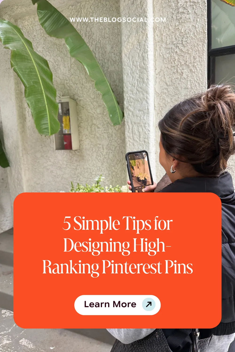
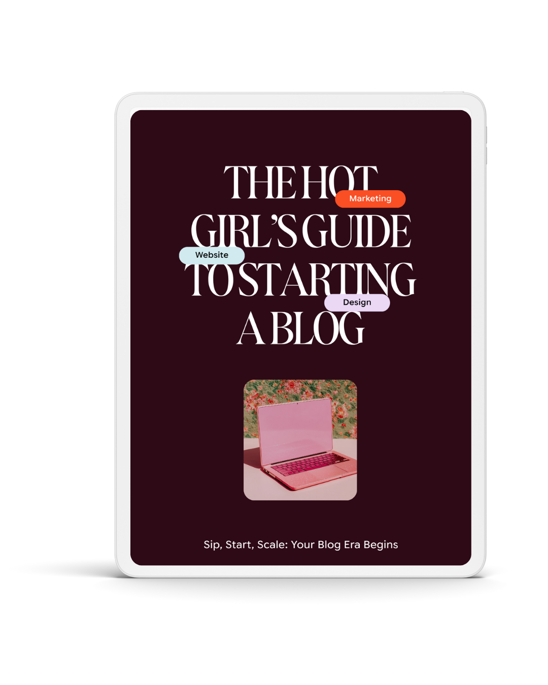
5 Simple Tips to Design Pinterest Pins to Increase Blog Traffic

Looking to drive Pinterest traffic? Having well-designed Pinterest templates is key! Here are some pin design tips to keep in mind when creating pins to boost traffic to your website.

1. Start with High-Quality Photos That Match the Content

Blurry, pixelated, or irrelevant images? Pinterest will pass. Your audience will, too. Your visuals (video pins and static pins) need to be sharp and 100% aligned with the content you’re linking to. If your pin is promoting a blog post about blogging tips, a random beach photo isn’t going to cut it. Pinterest is smart, and your visuals should match the message.

Pro Tip: Use clear, bright, vertical photos that stop the scroll and actually relate to your topic. Stock images from sites like Elevae Visuals or Vault Socials (yes, I see you) are great resources!

2. Choose Fonts That Are Easy to Read—Especially on Mobile

Here’s a truth bomb: your audience is mostly scrolling Pinterest on their phones. So if your font is tiny or covered in swirls like a wedding invitation from 2012, they’re not going to read it, let alone click.

Here’s your rule: Skip the fancy script fonts and stick to bold, clear typography that’s easy to read even at a glance. Make your headline the show’s star and don’t let it get lost in design fluff.

3. Test Both Standard and Long Pins

Pinterest isn’t a one-size-fits-all platform, especially when it comes to sizing. While the standard 2:3 ratio pins (1000 x 1500 px) are always safe, don’t be afraid to test longer pins (like 1000 x 2100 px). Long pins often stand out more in the feed and encourage more scrolling, which = more eyeballs. 

When you’re starting out, try both formats and keep an eye on which ones your audience engages with more. No guesswork—just data-backed decisions.

4. Pinterest Can Read Your Text (and Understand Your Images)

This is where your Pinterest strategy meets design. Pinterest isn’t just looking at your visuals—they’re analysing them. Yep, the platform can recognise objects in your image and read the words on your pin. That means your text overlay matters for more than just aesthetics.

Use keywords directly on your pin that reflect what the content is about. Think: “SEO Tips for Bloggers” or “How to Start a Blog in 2025.” This tells Pinterest and your ideal audience exactly what they’re getting.

5. Use Your Analytics to Design Smarter

Here’s a productivity tip that doubles as a growth hack: stop creating from scratch every single time. Once you’ve been consistently posting for a few months, it’s time to check the data.

Which templates are getting the most saves and clicks? What colors or layouts are drawing people in? Instead of reinventing the wheel, double down on what’s working and tweak what’s not. This is how you turn Pinterest into a traffic machine without burning out.

Final Thoughts

Designing high-ranking pins doesn’t have to be complicated. It just has to be intentional. Focus on clear, keyword-rich visuals, keep it mobile-friendly, and let the data guide your design choices. Over time, you’ll start to see which designs move the needle—and which ones don’t.

Share this Post:

3 Comments on 5 Simple Tips for Designing High-Ranking Pinterest Pins

Leave a Reply

Your email address will not be published. Required fields are marked *

Popular Posts

WHAT'S TRENDING:

Popular Posts

Add Some Spice to Your Blog

Grab my FREE Start‑A‑Blog Checklist and turn that “someday” idea into a live, traffic‑ready blog.

A light editorial still-life photograph of a spicy margarita resting on a simple outdoor table, with the surroundings intentionally minimal and undefined. The margarita is positioned on the left side of the frame, with open negative space. The drink is a traditional pale yellow margarita, with a Tajín chili rim and visible jalapeño slices. Lighting is bright natural daylight, soft and even. The image feels casual, aspirational, and magazine-coded, without feeling staged no people, no text, no borders. --ar 3:4 --profile cdolety --v 7 Job ID: 9a4faf74-2e10-4701-a0e8-d4a146030abc

Looking for something specific? Select a popular category or enter your search query below.

Join our Spicy Newsletters.

A light, editorial lifestyle photograph of palm tree shadows cast across a warm, neutral wall, with subtle hints of blush or coral tones. The composition focuses on light and shadow rather than objects. No people are visible. Lighting is bright and natural, creating an airy, sun-drenched mood. The image feels calm, optimistic, and aspirational, like a magazine detail shot no text, no borders. --ar 3:4 --profile cdolety --v 7 Job ID: 94ad6230-24e3-436d-9618-61738a495ed7
A modern editorial photograph featuring an extreme, intentional crop of a lifestyle object, cutting off part of its form in a way that feels slightly uncomfortable but deliberate. The background is neutral and uncluttered. Lighting is soft and restrained, avoiding high brightness. The image feels cool, experimental, and fashion-coded, like a detail shot in a high-end magazine no people, no text, no borders. --ar 3:4 --profile cdolety --v 7 Job ID: b1955216-cc70-43a2-80b1-c46e0d61ad2c
A modern editorial still-life photograph of a spicy margarita positioned on the left side of the composition, shot against a clean neutral background. Strong natural light casts a distinct but soft-edged shadow across the surface, creating visual interest. The drink is a classic pale yellow margarita, with a bold Tajín rim and jalapeño slices clearly visible. The styling is minimal and confident. The image feels graphic, intentional, and fashion-forward, like a magazine opener no people, no text, no borders. --ar 3:4 --profile cdolety --v 7 Job ID: e43d8b86-7960-46fd-bac9-1a92b7250600
A modern editorial photograph of two or three identical neutral notebooks or folders stacked neatly on a clean surface. The framing is tight and graphic, with the stack pushed toward one side of the frame. Lighting is soft and controlled, slightly desaturated. The image feels composed, calm, and intentional, like a fashion magazine’s take on productivity no people, no text, no borders. --ar 3:4 --profile cdolety --v 7 Job ID: 706d063d-b9c2-40da-bb82-5e3ba25f23a7
A light, editorial lifestyle photograph of palm tree shadows cast across a warm, neutral wall, with subtle hints of blush or coral tones. The composition focuses on light and shadow rather than objects. No people are visible. Lighting is bright and natural, creating an airy, sun-drenched mood. The image feels calm, optimistic, and aspirational, like a magazine detail shot no text, no borders. --ar 3:4 --profile cdolety --v 7 Job ID: 94ad6230-24e3-436d-9618-61738a495ed7
A modern editorial photograph featuring an extreme, intentional crop of a lifestyle object, cutting off part of its form in a way that feels slightly uncomfortable but deliberate. The background is neutral and uncluttered. Lighting is soft and restrained, avoiding high brightness. The image feels cool, experimental, and fashion-coded, like a detail shot in a high-end magazine no people, no text, no borders. --ar 3:4 --profile cdolety --v 7 Job ID: b1955216-cc70-43a2-80b1-c46e0d61ad2c
A modern editorial still-life photograph of a spicy margarita positioned on the left side of the composition, shot against a clean neutral background. Strong natural light casts a distinct but soft-edged shadow across the surface, creating visual interest. The drink is a classic pale yellow margarita, with a bold Tajín rim and jalapeño slices clearly visible. The styling is minimal and confident. The image feels graphic, intentional, and fashion-forward, like a magazine opener no people, no text, no borders. --ar 3:4 --profile cdolety --v 7 Job ID: e43d8b86-7960-46fd-bac9-1a92b7250600
A full-body editorial photograph of a woman walking slowly or standing mid-step in a minimal interior, styled in off-white clothing with a blush accent. The moment feels candid but composed, like an off-duty fashion capture. Her posture is relaxed, with natural movement and a soft, friendly smile. The composition feels effortless and photographic, not staged. Lighting is natural and flattering, enhancing warmth and softness. The image feels cool, approachable, and polished, inspired by Hailey Bieber’s casual editorial moments realistic, full-bleed photography with no borders or frames. --ar 3:4 --profile 399npew --v 7 Job ID: fdfea551-5dc3-4540-9fed-9a544b557891
THE BLOG SOCIAL / THE BLOG SOCIAL / THE BLOG SOCIAL /